
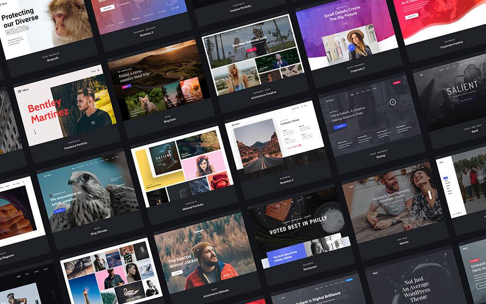
WordPressを利用したウェブサイトが増えています、無料テーマやプラグインなどが公開されており、実装も簡単という点も人気の理由かもしれません。
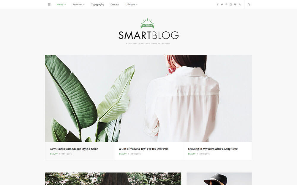
最近のWebデザインのトレンドで、iPhoneやiPadなど解像度に応じてウェブサイトを最適化する「レスポンシブWebデザイン」を利用したWordPress無料テーマ、あつめました。
海外デザインブログSpeckyboy Magazineでレスポンシブデザインに対応した無料WordPressテーマ15個をまとめたエントリー「15 Free WordPress Themes with a Responsive Layout」が公開されていたので、今回はご紹介します。
詳細は以下から。
レスポンシブデザインの無料WordPressテンプレートまとめ
どれもデモページが用意されているので、実際にウィンドウ幅を変えながら表示すると分かりやすいかと思います。
Ari
通常3カラムで表示されたシンプルなレイアウト、ギャラリーなども実装されており個人ブログなどにも適したテーマ。

[button_square color=”red” url=”http://ari.elmastudio.de/”] デモページ [/button_square] [button_square color=”green” url=”http://wordpress.org/extend/themes/ari”] ダウンロード [/button_square]
HTML5とCSS3でデザインされたWordPressテーマ。Google Webフォントなども利用されており、カスタマイズのしやすさもポイントです。

[button_square color=”red” url=”http://yoko.elmastudio.de/”] デモページ [/button_square] [button_square color=”green” url=”http://www.smashingmagazine.com/2011/06/07/free-html5-css3-wordpress-3-1-theme-with-responsive-layout-yoko/”] ダウンロード [/button_square]
apple社のWebサイトを連想させる洗練されたパーツが印象的なWordPress用テーマ、壁紙デザインなども変更可能。

[button_square color=”red” url=”http://themify.me/demo/#theme=itheme2″] デモページ [/button_square] [button_square color=”green” url=”http://themify.me/themes/itheme2″] ダウンロード [/button_square]
テキストやイメージ画像、動画などジャンルに応じてアイコン表示で分かりやすいWordPressテーマ、Tumblrノリで利用できそうです。

[button_square color=”red” url=”http://demo.wpzoom.com/?theme=bonpress”] デモページ [/button_square] [button_square color=”green” url=”http://www.wpzoom.com/themes/bonpress/”] ダウンロード [/button_square]
Facebookファンページ作成も可能なWordPressテーマ、詳しい内容についてはこちらのエントリーを参考に。

[button_square color=”red” url=”http://madeflexible.com/”] デモページ [/button_square] [button_square color=”green” url=”http://madeflexible.com/”] ダウンロード [/button_square]
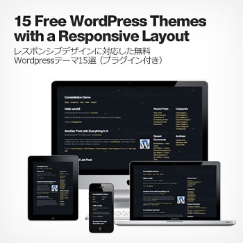
Constellation Theme for WordPress
アーカイブや人気記事、カテゴリー表示などもダッシュボードから簡単に設定できる親切WordPressテーマ。
")
[button_square color=”red” url=”http://constellationtheme.com/demo/”] デモページ [/button_square] [button_square color=”green” url=”http://constellationtheme.com/”] ダウンロード [/button_square]
カラムなど関係なくフルサイズのシングルカラムを利用したWordPressテーマ。

[button_square color=”red” url=”http://renova.llow.it/wordpress/”] デモページ [/button_square] [button_square color=”green” url=”http://www.llow.it/renova/”] ダウンロード [/button_square]
HTML5でデザインされており、Googleフォントなどにも対応したシンプルでモダンなレイアウトのWordPressテーマ。

[button_square color=”red” url=”http://wp-ecommerce.org/store1/”] デモページ [/button_square] [button_square color=”green” url=”http://premium.wpmudev.org/project/simplemarket”] ダウンロード [/button_square]
デザインの見た目だけではなく、表示速度などにもこだわったコーディングが特長のひとつでもあるWordPress
無料テーマ。

[button_square color=”red” url=”http://whiteboardframework.com/testdrive/”] デモページ [/button_square] [button_square color=”green” url=”http://whiteboardframework.com/”] ダウンロード [/button_square]
Webフォントが印象的なモノクロ&ピンクのオシャレWordPressテーマのひとつ。

[button_square color=”red” url=”http://blaskan.net/demo/”] デモページ [/button_square] [button_square color=”green” url=”https://github.com/persand/blaskan”] ダウンロード [/button_square]
テーマファイルにはCSS3でデザインされたボタンやトグルなどを利用できるショートコードも実装された便利アイテム。

[button_square color=”red” url=”http://demos.simplethemes.com/skeleton/”] デモページ [/button_square] [button_square color=”green” url=”http://www.simplethemes.com/blog/entry/skeleton-wordpress-theme”] ダウンロード [/button_square]
Responsive Twenty Ten

WordPressにあらかじめ実装されているデフォルトテーマをレスポンシブデザインに改良したユニークなテーマ。
[button_square color=”red” url=”http://demos.simplethemes.com/skeleton/”] デモページ [/button_square] [button_square color=”green” url=”http://www.simplethemes.com/blog/entry/skeleton-wordpress-theme”] ダウンロード [/button_square]
1140 Fluid Starkers WordPress Theme

ウィンドウの最大幅を1140pxのグリッドレイアウトを組むことができるWordPress用ワイヤーフレーム。
[button_square color=”green” url=”http://www.thedotmack.com/2011/07/19/1140-fluid-starkers-wordpress-theme/”] ダウンロード [/button_square]
レスポンシブデザインに関するjQueryプラグインなど
レスポンシブWebサイトを作成するときに便利なツールなどをまとめています、ご参考までに。
ウィンドウ幅に応じてフォントサイズを変更してくれるプラグイン、Webフォントを利用するときに便利。

[button_square color=”black” url=”https://github.com/davatron5000/FitText.js”] 無料ダウンロード [/button_square]
タイポグラフィーのカーニングや編集なども可能にするプラグイン、こちらもWebフォントとの併用を想定しています。

[button_square color=”black” url=”https://github.com/davatron5000/Lettering.js”] 無料ダウンロード [/button_square]
iPhoneなどのタッチスクリーンを触るスワイプ機能に対応したギャラリー用プラグイン。

[button_square color=”black” url=”http://github.com/downloads/codecomputerlove/PhotoSwipe/code.photoswipe-2.1.0.zip”] 無料ダウンロード [/button_square]
さまざまな画面解像度に対応するフレキシブルなイメージスライダー用プラグイン、これは便利。

[button_square color=”black” url=”http://flex.madebymufffin.com/files/FlexSlider-1.6.zip”] 無料ダウンロード [/button_square]
ふわっと画像が切り替わるエフェクトを加えたイメージスライド用jQueryプラグイン。

[button_square color=”red” url=”http://graphik.fi/lab/responsive-jquery-slideshow/”] デモページ [/button_square] [button_square color=”black” url=”http://blog.kiskolabs.com/post/5602656614/responsive-jquery-slideshow”] 無料ダウンロード [/button_square]
ウィンドウ幅に応じてYouTube動画のビデオサイズを変更する方法をCSSで解決しています。

[button_square color=”red” url=”http://css-tricks.com/examples/FluidWidthYouTube/”] デモページ [/button_square] [button_square color=”black” url=”http://css-tricks.com/examples/FluidWidthYouTube.zip”] 無料ダウンロード [/button_square]
レスポンシブデザインの便利ツール
Responsive Web Design Sketch Sheets
ウィンドウ幅に応じてレイアウトが変わってくるので、まとめて確認することができるスケッチ用PDFシート。印刷して手書きのモックアップに最適。

URLを打ち込むとさまざまなデバイスで表示された様子を確認することができるWebサービス。

スマートフォンなどのモバイル端末でサイトを表示したときのイメージファイルをリサイズします。

レスポンシブデザインに関するその他リソース、補足など
これまでにまとめられているレスポンシブWebデザインに関するエントリーを、いくつかピックアップさせてもらっています、感謝。
[list type=”hot”] [li]iPhoneやiPad等にもWebサイトを最適化するレスポンシブWebデザイン構築に役立つフレームワークやTipsいろいろ – かちびと.net [/li]
[li][CSS]スマフォ対応サイトのためにMedia Queriesをしっかり身につけるチュートリアル – coliss.com [/li]
[li]css3のMedia QueriesでスマートフォンやiPad等の様々なデバイスに対応済みのWordPressテーマいろいろ – かちびと.net [/li][/list]
CSS3のメディアクエリを利用したWebサイトデザイン30個まとめ+使い方
手前味噌となりますが、ウィンドウ幅に応じて変化するデザインに注目したまとめエントリー。

[参照元 : 15 Free WordPress Themes with a Responsive Layout – Speckyboy Magazine]


